Energy News Beat
It says: “Not yet,” and “Quite aways to go.” This trend has reversed before, but if it doesn’t and instead picks up momentum… Time to keep an eye on it.
By Wolf Richter for WOLF STREET.
When does a recession start? In the US, the National Bureau of Economic Research (NBER), which calls the official recessions in the US, has always defined recessions as broad economic downturns that include downturns in the labor market, such as declines in employment and significantly rising unemployment, neither of which have happened in this cycle.
My favorite recession indicator is the weekly data on the people who filed for unemployment insurance at least a week earlier and are still claiming unemployment insurance because they still haven’t found a job, what the Labor Department calls “Insured Unemployment.”
The black slanted line is the Recession Marker. The levels that entail a recession have risen over the decades as total employment has risen. This growth of employment over the decades causes the Recession Marker line to be slanted upward.
The current level of Insured Unemployment is still historically low, and far below the Recession Marker for this year of about 2.7 million.
The prior three business-cycle recessions – not counting the Pandemic which was a lockdown, not a business cycle recession – came after Insured Unemployment had surged to:
- 64 million in December 2008, beg. of Great Recession
- 56 million in March 2001, beg. of 2001 Recession
- 49 million in July 1990, beg. of 1990 Recession.
Today, the four-week moving average rose to 1.914 million, as the weekly total rose to 1.956 million, according to the Labor Department.
This shows that newly laid-off people – their numbers have been fairly low historically – are having a harder time finding a new job, than they did some months ago.
So it’s not that there is a big wave of job cutting, there isn’t, and employment overall continues to grow. But employers have slowed absorbing the people that have been laid off, and the number of people on Unemployment Insurance has been increasing at an accelerated pace and in early May started exceeding the mid-November level. The purple columns indicate recessions.
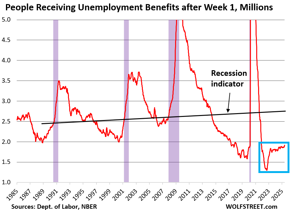
If this trend doesn’t reverse… While the level itself remains relatively low, and quite a bit below the recession marker (black line), the trend is going in the wrong direction at a now significant pace.
This trend has occurred before, and then it reversed before reaching anything near critical mass, and the economy kept plugging along just fine.
But if this trend persists, if it does not reverse, but just keeps heading higher toward critical mass, the indicator is going to ring a recession warning bell.
Not a “lagging indicator.” These weekly data for unemployment insurance benefits are the earliest indicators of systemic job losses. The data track the number of people receiving unemployment benefits after their initial claim.
A business-cycle recession starts in a specific month, as called out by the NBER. My favorite Recession Indicator gave advance notice of the beginning of the past business-cycle recessions, without having given false positives (indicating a recession when there was none).
The NBER identifies the start-date of a recession often months after the fact. So the NBER’s determination is lagging and backward-looking. But the start-date of the recession, as called out by the NBER, was indicated well ahead of time by this Recession Indicator.
It’s weekly data, released only a few days after the end of the reporting week, and is the most current. It’s not based on surveys. And it has not given false positives yet, unlike some others, including the yield curve and the Sahm Rule which registered recessions in a strong economy.
I use the four-week moving average (which the Labor Department also publishes) because the week-to-week data jump up and down as big states, when they miss the weekly deadline to process all their unemployment claims data and then submit it in the following week, cause the weekly figure to be low in one week and then high in the next. All states do that from time to time, but the big states move the needle. This kind of stuff has nothing to do with the labor market or unemployment and needs to be filtered out by averaging out the weekly data over four weeks.
We give you energy news and help invest in energy projects too, click here to learn more
Crude Oil, LNG, Jet Fuel price quote
ENB Top News
ENB
Energy Dashboard
ENB Podcast
ENB Substack
The post Recession Watch: My Favorite Recession Indicator, Mid-June Update appeared first on Energy News Beat.